

A quote form should make it easier to start a conversation, not turn a simple enquiry into a twenty-question interview.
Someone browsing on a phone may be on a break, standing at a work site or comparing a few providers. If the form is long, confusing or difficult to tap, they may abandon it even when they want the service.
I’d design the first form around the information the business genuinely needs to decide what happens next.
Decide what a first enquiry must contain
For many local services, that means a name, a reliable contact method, the service needed, a rough location and a short description of the job.
Extra fields should earn their place. Timing can be useful when scheduling is the main constraint. A budget range might help with large projects, but it shouldn’t be required if customers cannot reasonably know it yet.
Don’t ask for a full postal address, detailed personal information or payment details when none of that is needed to start the conversation.
Use labels people don’t have to interpret
A field labelled “Project scope details” might confuse someone who just wants a leaking tap repaired.
“Tell us what you need help with” is often clearer. A helpful example can explain what kind of detail is useful without dictating an answer.
Keep field labels visible. Placeholder text alone can disappear as someone types, making it harder to remember what the field was asking.
Make the form work on an actual phone
Use appropriately sized input controls and tap targets. Match keyboard types to the fields: email-friendly entry for an email address and telephone input for a phone number.
Check that the submit button is visible, error messages are readable and the layout doesn’t jump around when the keyboard opens.
Test with one hand, with autofill and with a longer message. It’s surprisingly easy to approve a form on desktop that is unpleasant on mobile.
Handle errors without punishing the visitor
If a customer mistypes an email or misses a required field, explain the issue near the relevant input and preserve what they’ve already entered.
Avoid resetting the form or showing a vague “Something went wrong” when a more useful message is possible.
Make errors accessible to assistive technology and don’t rely on colour alone. A red border without an explanation may not be enough.
Explain what happens after submission
A successful form should provide clear confirmation.
Tell the customer that the request was received and, if your business can reliably commit to it, when or how they should expect a response. Offer an alternative contact method when appropriate.
Don’t promise an immediate callback unless the team can actually provide one.
Test the receiving side as well. A form that displays “Success” but never sends a usable enquiry isn’t a functioning lead system.
Add uploads only when they’re genuinely useful
Photos can help some contractors understand the nature of a job before visiting.
If you allow uploads, explain what images are helpful and discourage customers from including unnecessary private information. Make uploads optional unless the business has a strong reason to require them.
Check file handling, size limits, error messages and who can access the submitted information.
Keep privacy proportional
The first enquiry isn’t the place to collect every detail that might be useful later.
Ask only for information you need, explain how it will be used and ensure the form and analytics tools treat personal data appropriately.
If you track submissions as conversions, check that only successful completions are counted and that sensitive form contents aren’t sent to advertising platforms.
See conversion tracking for local ads for a simple measurement model.
Test the complete journey
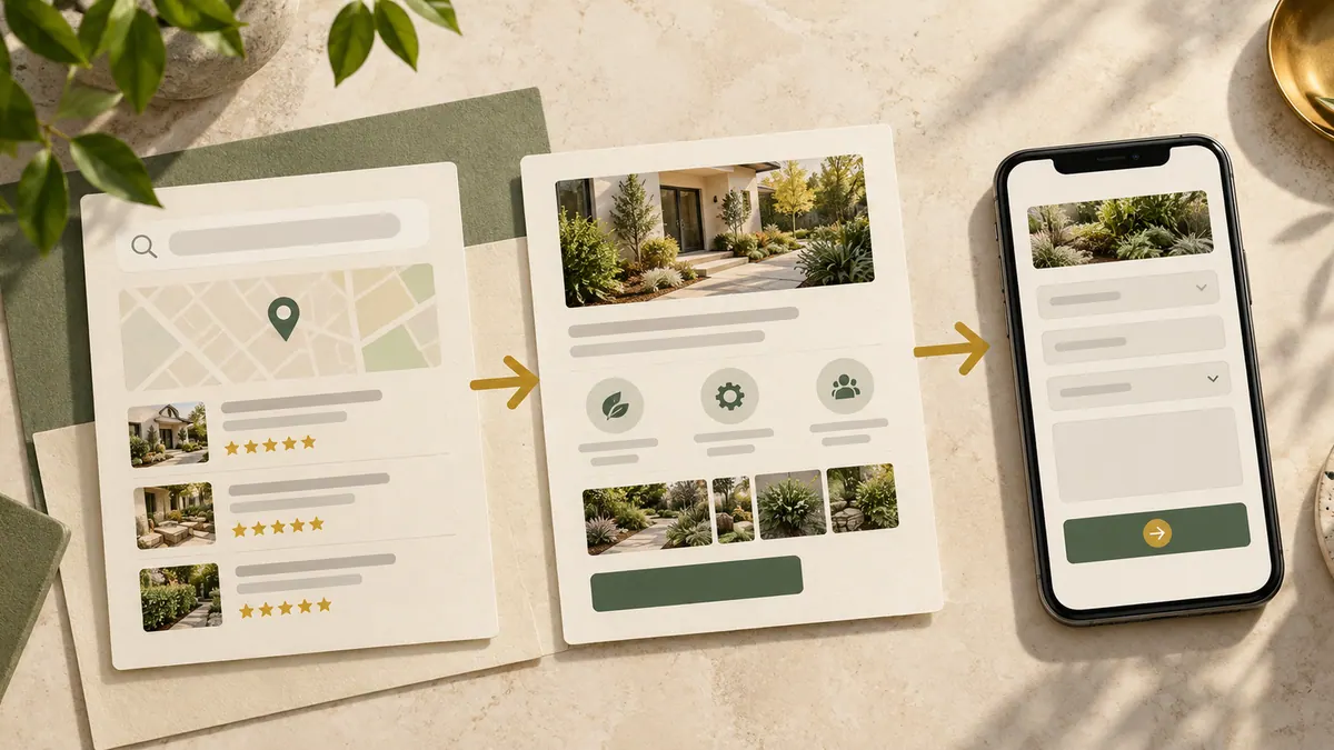
Start from a relevant service page, follow the call to action and complete the form on a phone.
Submit a valid test, then trigger a validation error. Verify the confirmation and that the business receives the expected message. Check what happens if an external integration is temporarily unavailable.
If a test exposes confusion, shorten or clarify the form before making the campaign busier.
A mobile form should connect to a reliable website journey; see the small-business website checklist for the surrounding basics.
Frequently asked questions
How many fields should a mobile quote form have?
Only the fields needed for the next decision. The right number depends on the service; shorter is not automatically better if the business can’t respond meaningfully.
Should every field be required?
No. Require only essential information. Optional details can help without blocking a customer from starting.
Should I ask for a budget?
Only if the business needs it to qualify or plan the enquiry, and the question makes sense to customers.
What should happen after someone submits?
A clear confirmation, correct delivery to the team and a realistic follow-up process.
The best form is the shortest path to a useful conversation, not the longest collection of possible customer details.