

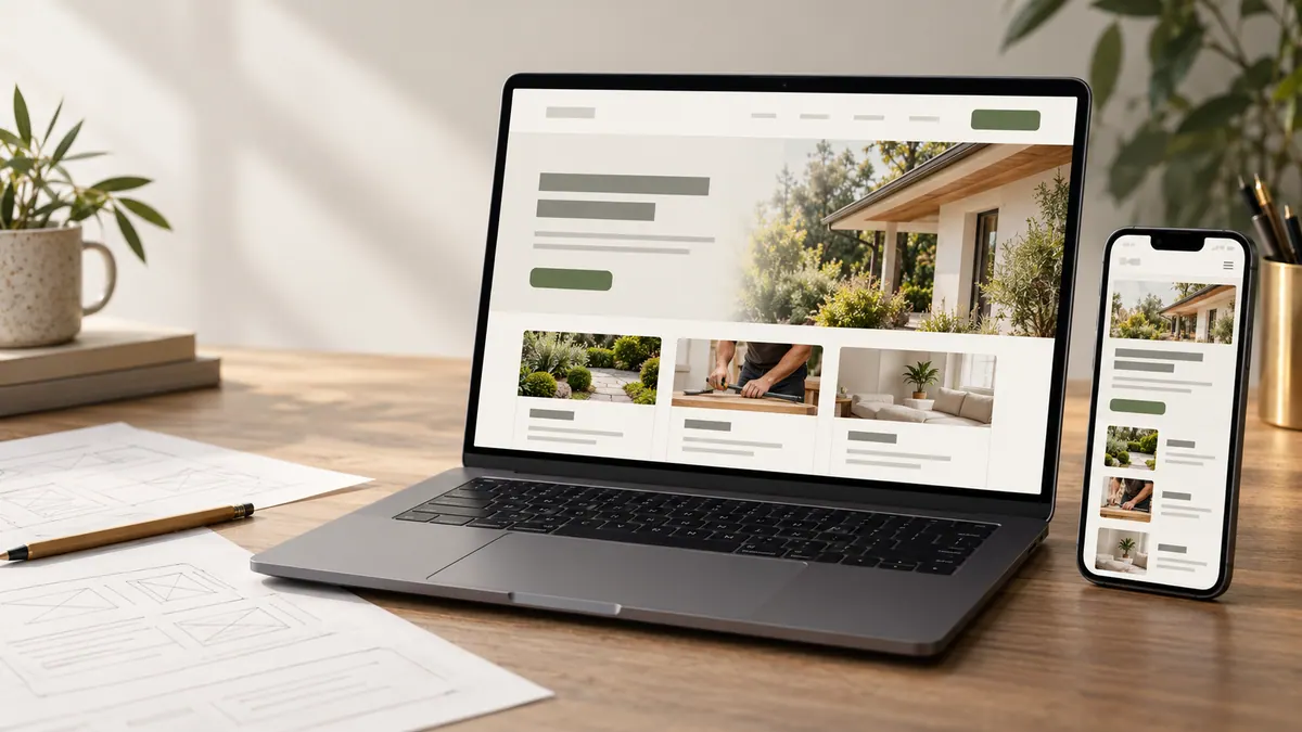
A good project photo can help someone see the quality of your work. But not everyone experiences a website visually. If the image is meaningful, its alternative text should help someone using a screen reader understand the same useful information.
Alt text isn’t a secret space for search keywords. It’s part of making the website understandable.
First ask what the image is doing
Before writing anything, look at the image in context. Is it showing a finished job, demonstrating a step, identifying a person or simply adding colour to the page?
An image that communicates information generally needs a concise description. A decorative background may need an empty alt attribute so it isn’t read aloud unnecessarily. A link or icon may need an accessible name that describes its action rather than what the icon looks like.
This distinction matters more than trying to force a keyword into every image.
A few before-and-after examples
Imagine a heating company showing a technician at work.
Weak: “HVAC repair best heating company near me.”
Better: “Technician checking a wall-mounted heat pump during a service visit.”
The second sentence helps someone understand what is visible. It doesn’t invent a location or claim a repair succeeded.
For a contractor project image, “New timber deck with steps leading into the garden” is clearer than “Our amazing quality deck installation.” For a real storefront, “Front entrance of the shop beside the parking area” may help someone recognize where to go.
Write what the image shows and why it matters in that position on the page.
Project galleries need different descriptions
If a page has six photos of one renovation, don’t reuse “kitchen renovation” six times. Someone moving through the gallery needs to know what each view contributes.
One might show the room before work. Another might show cabinet installation. A third might show the finished counter and storage layout. A final close-up might highlight a detail that matters to customers.
If you’re using before-and-after images, identify the stages accurately. Don’t claim that the photos prove increased property value, energy savings or any other result without evidence.
When empty alt text is the right choice
Not every image needs a spoken description. A decorative line, background pattern or repeated illustration that adds no meaningful information can use empty alt text in the HTML.
That is different from leaving the alt attribute out. The intent is to let assistive technology skip decoration rather than announce an unhelpful file name.
A logo may need the business name when it conveys identity. A magnifying-glass icon used as the only label on a search button needs an accessible action such as “Search.” If the button already has visible, accessible text, adding a second redundant name may be unnecessary.
Keep important instructions outside images
Suppose a contractor publishes an infographic showing what customers should prepare before an estimate. Putting every instruction inside the image makes it harder for some people to access.
Provide the steps as actual page text. Then decide whether the graphic needs a brief overview, an extended description or a link to the same information in text.
The same applies to promotional graphics with dates, opening hours or service-area limitations. Visitors shouldn’t lose that information when the image doesn’t load.
Don’t confuse image SEO with keyword stuffing
Search engines can use alt text and surrounding content to understand an image. That’s helpful, but the primary job of the description is communicating meaning.
Avoid lists of suburbs, identical phrases across different photos, or invented job locations. Explain the service and place naturally in the page copy instead.
A good article about optimizing website images for speed can help you handle the performance side without sacrificing useful photography.
A quick editing routine
Open a page and inspect every image in order. Ask whether it is informative or decorative. Read the proposed alt text without looking at the image: would someone understand what they are missing? Then check for repeated words, unsupported claims and lengthy descriptions that don’t add value.
For a gallery, make each description distinct. For an icon-only button, verify the whole control has a meaningful accessible name. If possible, test with a screen reader or ask someone familiar with assistive technology to review important journeys.
The W3C’s images accessibility tutorial is a useful reference for deciding between informative, functional and decorative images.
Good image descriptions fit into a wider small-business website checklist, where accessibility and clarity work together.
Frequently asked questions
Should every image have a keyword in its alt text?
No. Describe the content or function that matters. Relevant words may occur naturally, but keyword repetition makes the description less useful.
How long should alt text be?
As short as it can be while still communicating the important detail. Complex charts may need a separate text explanation rather than an enormous alt attribute.
Should decorative images have alt text?
They should generally use an empty alt value so screen readers can skip them, assuming they truly add no information.
Can I use the same alt text for all my project photos?
Not if the pictures convey different details. Describe what’s distinct about each meaningful image.
Accessible images are one small part of a good business website, but they’re a good habit to get right from the beginning.