

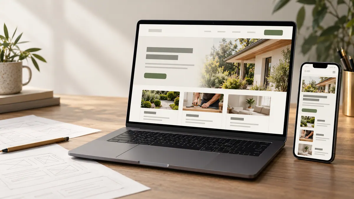
For a contractor, restaurant or service business, photos can do a lot of the work of building trust. They show the space, the people and the work behind the words.
But a page full of huge photographs can be frustrating on a phone. The visitor waits for images to appear, the layout moves around and the contact button becomes harder to reach.
The answer isn’t to delete the photographs. It’s to serve the right image at the right size.
Keep the original and publish a smaller version
A photo straight from a camera may be far larger than the space where it appears on the website.
Keep the original file in your business archive. Then prepare an optimized version for its intended use. A thumbnail in a grid doesn’t need the same dimensions as a full-width project hero.
This approach protects quality. You can always return to the original if the design changes later.
Size images for the actual layout
Check how wide the image appears on desktop, tablet and mobile. Then prepare an appropriate set of sizes.
Modern websites can use responsive image features to offer different file sizes for different screens. The browser selects a suitable version instead of downloading the largest file for every visitor.
You don’t need to know every technical detail to evaluate the result: the image should look clear at its displayed size without being dramatically larger than necessary.
Choose formats based on the image
Modern formats such as WebP and AVIF can deliver strong compression for many photographs. JPEG and PNG still have their uses, depending on compatibility, transparency and the type of image.
Logos and simple graphics may be better as SVG where appropriate. Screenshots with fine text need enough clarity to remain readable.
Don’t choose a format because it’s fashionable. Compare quality at the actual size and confirm that your build process supports it properly.
Avoid ruining project details
A close-up of cabinetry, tile work or technical equipment may need more detail than a decorative background image.
Compressing until edges and textures look muddy defeats the point of publishing the photo. Review the image on a typical phone and a larger screen before approving it.
Cropping matters too. A square gallery image may need a different focal point from the full-width version. Automatically cropping the same file everywhere can cut off the very detail the customer needs to see.
Stop the page jumping while images load
When the browser doesn’t know an image’s size, text and buttons may shift as it arrives. That can be annoying and can contribute to poor Cumulative Layout Shift.
Reserve space with appropriate dimensions or aspect ratios. The browser can then build a stable page before the image loads.
This detail makes the site feel calmer, particularly around forms and calls to action.
Lazy-load the right images, not all of them
Photographs far down the page can often load only as the visitor approaches them. That reduces initial network work.
But the main hero or other content likely to be visible immediately shouldn’t automatically be deferred in the same way. Delaying the most important image can hurt the perceived loading experience.
Prioritize the first meaningful view and let the later gallery load when needed.
Optimize the rest of the page too
A website can still be slow after every image has been compressed.
Third-party scripts, video embeds, large fonts and unnecessary JavaScript may contribute more than expected. Test actual pages to see where time is being spent.
Google’s Core Web Vitals focus on loading, responsiveness and visual stability. See the Core Web Vitals reference for how the metrics are defined.
Use measurements to guide changes, but don’t turn a perfect score into the goal of the website. A page needs to remain readable and useful.
Make image preparation a repeatable habit
For every new image, record where it will be used, what crop works, which responsive sizes are needed, whether it needs alt text and who approved it.
Use clear file names that make the media library manageable. Write descriptions of informative images for accessibility, not as a place to hide keyword lists. Our alt text guide covers that.
Finally, test the page on a phone with a slower connection. Notice how quickly a visitor can understand the service and reach the next step.
Linking should support the same customer journey as service-page planning, not create a repeated list of keywords.
Frequently asked questions
Does every photo need WebP or AVIF?
No. Choose formats supported by your site and appropriate for the image. Actual file size and quality matter more than the extension alone.
Should I lazy-load the homepage hero image?
Usually, loading the main visible image promptly is important. Decide based on measured page behaviour rather than a blanket rule.
Will smaller images automatically improve SEO rankings?
No single optimization guarantees rankings. Faster, more stable pages can improve the visitor experience and support technical quality.
Can I use the same image size everywhere?
You can, but responsive sizes are often a better way to avoid sending unnecessarily large files to small screens.
Keep the images worth seeing. Just don’t make customers wait longer than necessary to see them.