

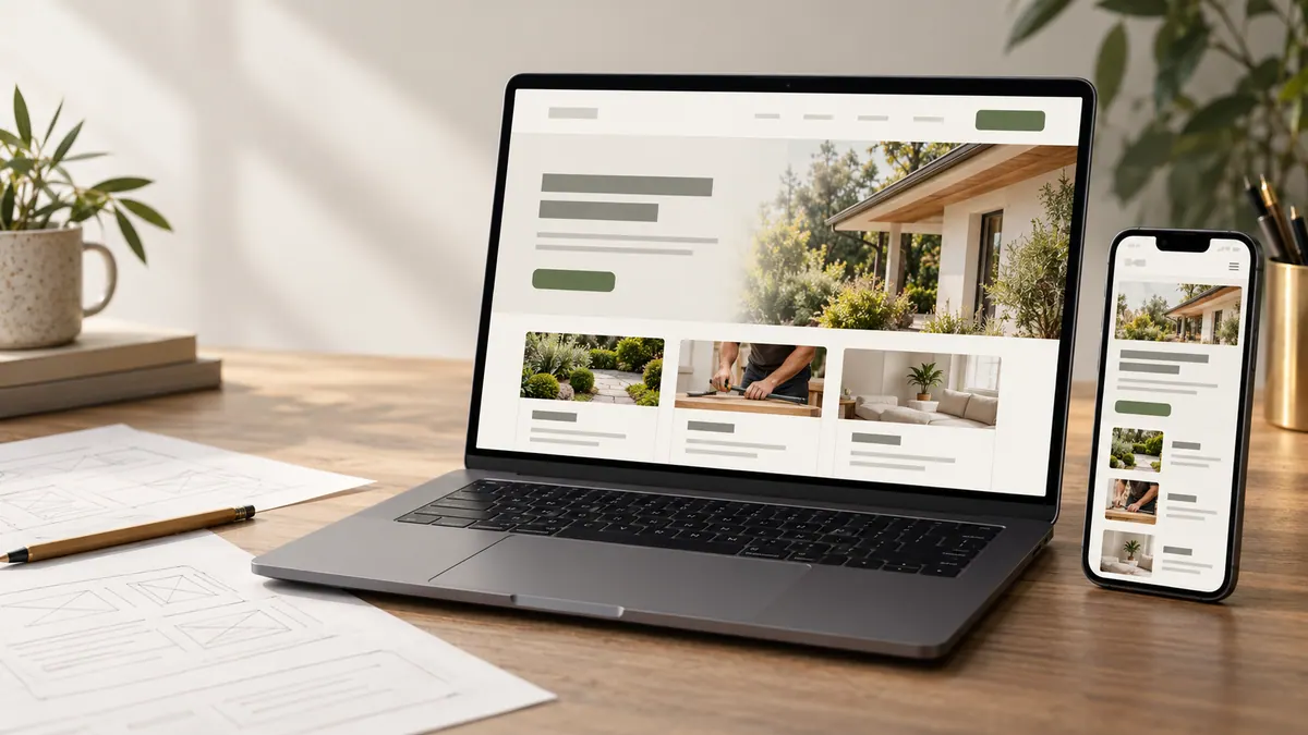
A potential customer looking for a roofer, electrician, remodeler or other contractor is rarely browsing for entertainment. They want to know whether you do the work, whether you cover their area and whether you’re a company they can trust with the job.
Your homepage has a few seconds to make those answers easier to find. Not because of a magical ten-second ranking rule, but because people shouldn’t have to decode your business.
Here’s how I’d review a contractor homepage before spending money driving more visitors to it.
The first screen: say what you actually do
Start with the trade or service, who you work for and the area you genuinely cover.
“Roof repairs and replacements for homeowners in [verified service area]” is clearer than “Building excellence through innovation.” The former tells someone whether they’ve come to the right place.
Keep the primary action close to that message. If customers usually call for urgent work, make calling easy. If the team needs project details to quote accurately, use a clear “Request an Estimate” link.
Don’t put a claim in the headline that the team can’t deliver. “24/7 emergency response” sounds persuasive until nobody answers on Sunday.
Show the services customers compare
Under the introduction, organize the main services into understandable choices. A plumbing business may need distinct paths for leaks, water heater work and remodels. A landscaping company may separate routine maintenance from design and installation.
Write short descriptions that explain the difference. People often know the problem, not the technical name for the service.
If your offers are meaningfully different, link to focused pages that explain scope, questions and next steps. The guide to one service page for one customer need covers how to plan that structure.
Put proof beside the claim
Anyone can write “reliable,” “experienced” or “quality workmanship.” Showing real work and explaining the process is more useful.
Include accurate project photographs, approved reviews, relevant licenses or credentials and a brief description of how estimates and scheduling work.
You don’t need to display all your proof at once. Match the evidence to the visitor’s concern. An emergency customer may care about availability. Someone planning a major renovation may want completed examples and a clear process.
A good contractor case study can provide deeper proof when the visitor is ready.
Explain where the business works
“Serving the entire region” can be misleading if the team regularly turns down enquiries from half the towns named.
List the core area in plain language, and explain important restrictions. If some services are available farther away only for larger jobs, say so. It saves wasted calls for everyone.
Avoid filling the footer with dozens of keyword-stuffed towns. For a more considered approach, read how to explain your service area.
Make mobile contact easy
Open the site on an actual phone and try to complete a customer task.
Can you tap the menu without accidentally selecting a different item? Is the phone number clickable? Can you read the service descriptions without zooming? Does the quote form work with one hand?
A visitor may be standing beside a leaking pipe or taking a short break between tasks. They shouldn’t need a desktop computer to contact you.
If the form is long, ask whether each question helps decide the next step. Our mobile quote form guide explains how to reduce unnecessary friction.
Tell the customer what happens next
A lot of contractor sites jump from “Get a Quote” to a blank form without explaining the process.
A short paragraph can say whether someone will call, what information helps with an estimate and whether an on-site assessment might be needed. Don’t promise a response time or a free visit unless the business can consistently honour it.
Clear expectations qualify enquiries and help customers feel comfortable reaching out.
Make the homepage work with the rest of the website
The homepage isn’t supposed to hold every detail.
Link to useful service pages, relevant project work, frequently asked questions and a contact route. A visitor who wants more information should be able to continue without starting over in search results.
Use descriptive link labels instead of four identical “Learn More” buttons. Keep navigation manageable. Test that the footer, menu and major calls to action all work.
The five-minute outsider test
Ask someone who doesn’t work for the business to open the homepage and answer five questions without help:
What does this company do? Where does it work? What service would I choose for a common problem? What proof is available? How do I contact it?
Watch where they hesitate. If they can’t answer a question, fix the words or layout before adding more visual effects.
This is also a useful starting point for checking what makes a good small-business website.
A strong homepage should connect to useful service information; compare it with what makes a good small-business website.
Frequently asked questions
Does a contractor need a separate page for every service?
Only when the services deserve distinct explanations and people make different decisions about them. Avoid dozens of thin pages that say nearly the same thing.
Should prices appear on the homepage?
Give the context you can accurately provide. Some businesses can show starting prices or call-out fees; others need a site assessment before quoting. Don’t guess.
Are customer reviews enough to prove quality?
They’re useful, but approved project images, clear scope descriptions and honest process information can answer questions that a star rating cannot.
Is the homepage more important than service pages?
They serve different purposes. The homepage introduces the business; service pages help visitors evaluate a particular need.
A useful homepage doesn’t try to impress every visitor. It helps the right one feel confident taking the next step.